

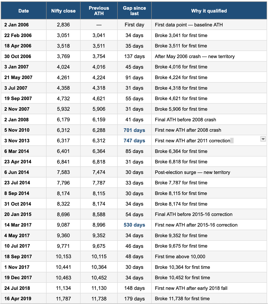
Recently, the Nifty 50 did what it has done many times over the last 20 years. It reached a point it had never been before.
All-time highs.
It crossed a new peak, moving past levels that, not too long ago, felt impossible. And like always, the reactions around it were very familiar.
All-time highs always divide investors like you and me. Some people start getting anxious and think this might be a good time to book profits. The market has been positive for a long time, portfolios are up, and it starts to feel like things are getting a bit too hot.
At that point, the thought is maybe it’s better to sell now and come back later when markets fall.
But the truth is, you can’t really tell when the market will fall.
And then one morning, the index hits another all-time high, and something clicks. You feel like you’ve seen enough. You sell everything, planning to re-enter when markets are lower.
But there are also other investors who see this very differently. To them, all-time highs aren’t a warning sign. They’re just part of how markets work. Markets grow over time, and if markets keep growing, they will keep making new highs. So instead of trying to exit, they just stay invested.
So in the end, you usually end up with two kinds of investors.
Those who sell at highs, and those who stay invested.
And what makes selling at highs so convincing is that it doesn’t feel like a mistake when you do it. It feels logical. It feels like you are being disciplined and protecting your profits.
But the real question is whether this actually works.
Can you really time the market by selling when it feels like markets are at a peak?
So instead of debating this theoretically, we decided to test it using actual data.
We took 20 years of Nifty 50 daily closing data, from January 2006 to March 2026, covering 5,017 trading days, and asked a very simple question:
Every time the Nifty hit an all-time high, what actually happened next?
The Experiment
First, we had to define what “feels like a peak.”
Because in real life, nobody knows the exact top. So we needed a clear rule.
We chose all-time highs.
An all-time high is when the Nifty reaches a level it has never reached before. This is usually the moment when many investors feel uncomfortable. Prices are high, markets have been going up for a while, and it starts to feel like “this can’t go much higher.”
So we treated every all-time high as a moment when a “peak seller” might decide to exit.
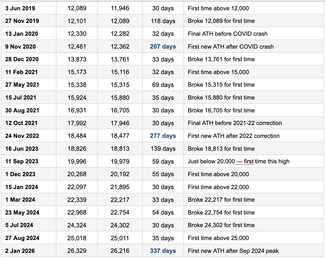
Then we looked at data from January 2006 to March 2026.
Every time the Nifty hit a new all-time high, we marked that day. But markets often keep hitting new highs continuously during a rally. So, to avoid counting too many similar points, we only considered highs that were at least 30 trading days apart.
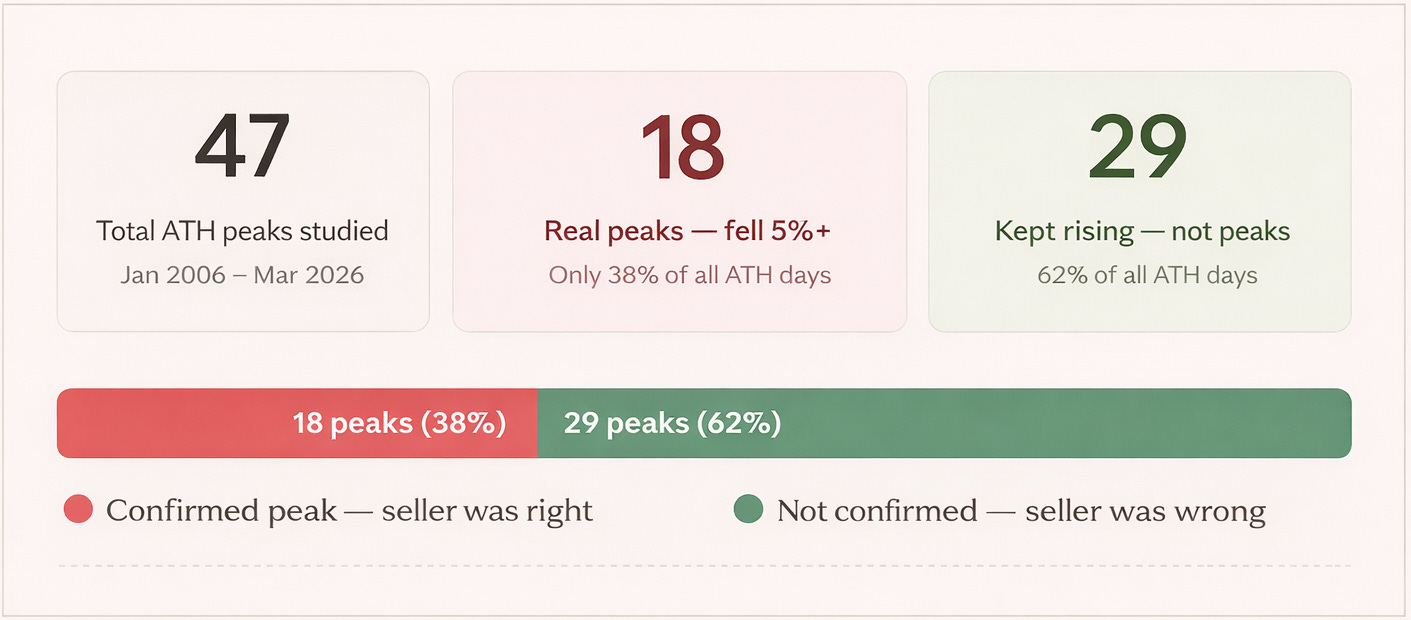
After applying this filter, we got 47 such moments over 20 years.
We then asked two questions:
1. Was it actually a peak?
We defined a “real peak” as a situation where the Nifty fell at least 5% within the next 3 months. If it did not fall that much, then selling at that point would not have helped.
2. What happened after that day?
We tracked how the Nifty performed in the short term, looking at returns after 1, 5, 10, and 30 days.
Results:

Every dot on this chart shows a time when the market was at its highest level ever.
The red triangles show times when the market actually fell after that. The green circles show times when the market kept going up, so selling would have been a mistake.
There are almost twice as many green circles as red triangles.
Out of 47 times the market hit a new high, only 18 times it fell within the next three months.
The other 29 times, more than half, it just kept going higher.
So if your rule was to sell every time Nifty hits a new high, you would usually be wrong.
You would sell, then watch the market go up, and end up buying back at a higher price. You would also lose money on fees and taxes and go through unnecessary stress for a worse result than simply staying invested.
Unpredictability
If you zoom in on what happens right after an all-time high, one thing becomes clear. There is no clear pattern.
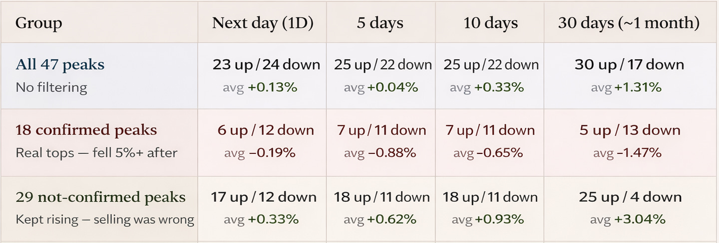
Across all 47 all-time highs, the Nifty went up the next day 23 times and went down 24 times. The average return was +0.13%, and the median was essentially zero. That is as close to random as it gets. An all-time high, by itself, does not tell you anything about what the market will do tomorrow.
Even if you extend the window slightly, the picture doesn’t change much. After 5 days and 10 days, the number of positive and negative outcomes is still fairly balanced. By 30 days, the market is positive more often (30 up vs 17 down), but that reflects the general upward drift of equities over time, not any specific signal from being at an all-time high.
But this average hides something important.
When you split these 47 moments into two groups (the ones that actually turned out to be peaks, and the ones that didn’t), the difference becomes obvious.
In the 18 cases where the market did fall meaningfully after, the data is consistently negative. The next day itself leans downward, and over 5, 10, and 30 days, returns remain negative on average. By 30 days, only 5 out of 18 cases were positive, and the average return was –1.47%. When it really was a peak, the market tended to drift lower afterwards.
In the remaining 29 cases, the exact opposite happens. These are the times when the market did not fall. It kept moving higher. The next day is more often positive, and that trend continues over longer periods. By 30 days, 25 out of 29 cases were positive, with an average return of +3.04%. When it wasn’t a real peak, the market usually continued rising, and quite strongly, too.
So in hindsight, the distinction is clean. Some all-time highs are genuine turning points, and others are just pauses before the next leg up.
But in real time, there is no difference.
On that day, all 47 moments looked the same, the market was at a new high after a strong run, and it felt like maybe things had gone too far.
But there was no clear sign to tell what would happen next, you could not know if this would be one of the 18 times the market falls or one of the 29 times it keeps going up.
That is why the next day looks like a coin toss, because in that moment it really is.
What you should conclude from this?
Even when you correctly identify a peak, it doesn’t play out the way you expect.
In most cases, the market does not fall immediately after the peak. It either goes higher or moves sideways first. In your data, this happened in 15 out of 18 cases.
Only in a small number of cases (3 out of 18) does the market fall quickly and make your decision look right immediately.
Even at real peaks, the drop took time
Among the 18 confirmed peaks, the fall didn’t arrive immediately. On average it took 27 trading days before the Nifty dropped even 5% from the peak.
What was actually happening during those 27 days of waiting
This is the most misunderstood part of the study.
When we say it took around 27 days on average for the fall to arrive, the natural assumption is that the market must have been drifting lower during that time. Slowly falling, day after day, validating the decision to sell.
That is not what happened.
To understand this properly, we looked at something very specific: what was the highest level the market reached after the all-time high before the eventual 5% fall arrived?
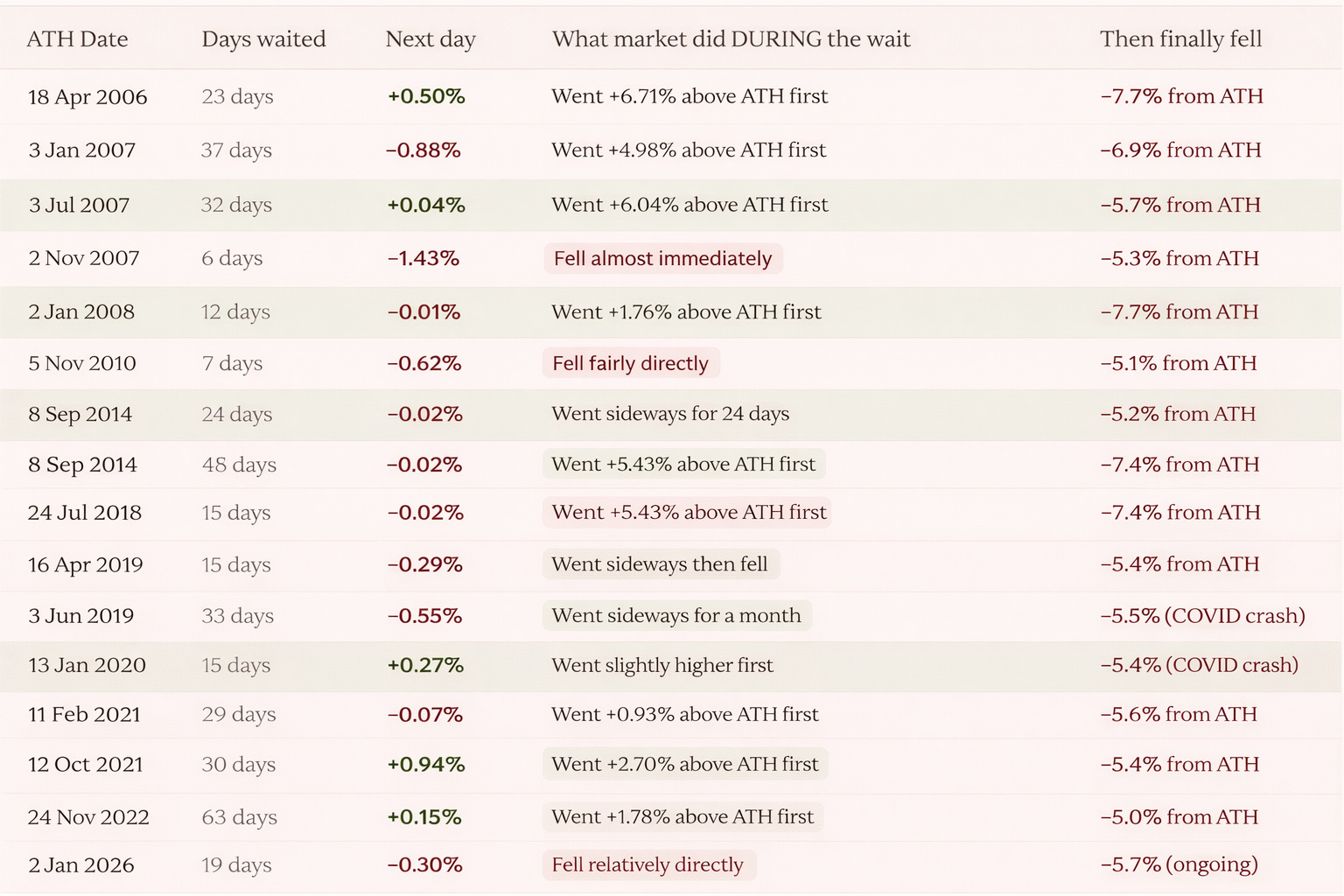
And that changes the picture completely.
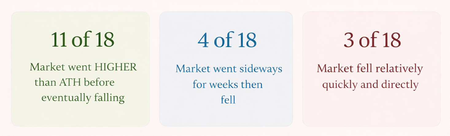
In 11 out of 18 confirmed peaks, the market did not fall after the peak. It went higher first. Not sideways, not flat, but clearly higher.
This means an investor who sold at the all-time high would have watched the market move above their exit price, sometimes for days, sometimes for weeks. They were eventually right about the direction, but in real time it would not have felt that way.
Take July 2018. The Nifty hits an all-time high at 11,134 and you sell. Over the next 48 days, the market rose another 5.43%, reaching around 11,740. Only after that did it fall enough to qualify as a correction. For those 48 days, the market is trading above your selling price, with no clear sign that a fall is coming, only the feeling that the market keeps going up.
The same pattern shows up again in August 2024. The Nifty peaks at 25,018 and you exit. Over the next 55 days, the market climbs another 4.79%, touching nearly 26,250. Only then does it fall past the 5% mark. Again, the call was right, but only after a long stretch where the market moved against it.
There is another version of this.
In 4 out of 18 cases, the market did not go higher, but it did not fall either. It simply moved sideways for weeks before eventually dropping. From the outside, this is even harder to deal with, because there is no movement, no confirmation, and no clarity on whether to stay out or get back in.
And then there are the clean cases.
Only 3 out of 18 peaks behaved the way most people expect, where the market falls quickly and directly after the peak, like in November 2007, November 2010, and November 2013. These are the moments that make selling feel right, but they are rare.
So what this actually means is simple. Even when the peak is identified correctly, the experience does not feel right.
Most of the time, after selling, the market either moves higher or goes nowhere for weeks. Very rarely does it immediately confirm the decision, and that is where the real difficulty comes from.
Because in real time, there is no clarity on which situation is playing out. It is not possible to know whether this is one of the few cases where the market will fall immediately, or one of the many where it will rise further before falling, or just drift sideways.
So the reaction follows a pattern. You sell, the market goes higher, doubt sets in, and you buy back in, often at a higher price. And only after that does the fall come.
That is why timing peaks is so difficult in practice. Not because the direction is always wrong, but because the path makes it very hard to stick with the decision.
Note:
This study only looks at all-time highs that are at least 30 days apart. This helps avoid counting the same rally again and again. But it also means the study is only looking at specific situations, not every time the market feels expensive. For example, if someone sells on a random day during a bull run, that situation isn’t included here.
So the results only apply to all-time highs, not every selling decision.
Next, the study defines a “peak” as a 5% fall within three months. But this is just a choice. If 3% was used, there would be more peaks. If 10% was used, there would be fewer. So the exact numbers depend on this rule. Still, the main idea remains: most of the time, markets keep going up even after hitting new highs.
Very good
With due respect sir, it will be good if you also provide an excel sheet where an individual can filter similar data unlike using 5 year peak. By the way you guys are awesome Groww.