

February 2020, Barcelona, Spain.
F1 teams had arrived for pre-season testing, ready to show the world their brand-new cars.
And before the season had even begun, one team caught everyone’s attention.
Racing Point, formerly known as Force India.
Their new car looked strikingly similar to the Mercedes that had won the championship the previous year.
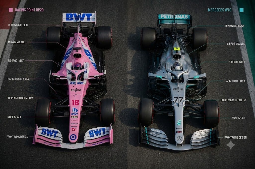
The nose looked like a Mercedes. The sidepods looked like a Mercedes. Even the overall aerodynamic concept and design philosophy appeared strikingly similar.
People started calling it “The Pink Mercedes”.
Instead of designing their own car from scratch, Racing Point had used high-resolution photographs and 3D cameras to reverse-engineer and replicate the external aerodynamic surfaces of Mercedes’ winning 2019 car, the W10.
This sparked a major controversy.
The team was fined €400,000 and lost 15 championship points for using Mercedes-inspired rear brake duct designs. However, Racing Point was still allowed to use the parts for the rest of the season.
F1 teams don’t have complete freedom when designing their cars. They all have to follow the same rulebook.
For example, every team must use a similar 1.6-litre turbocharged V6 engine. There are also limits on how much fuel a car can use during a race.
Even with the tyres, teams must follow rules on tyre pressure and temperature set by the FIA and tyre supplier Pirelli.
The wings are regulated too. The FIA specifies how large they can be and how many aerodynamic elements they are allowed to have.
In many ways, F1 is a puzzle where everyone is given the same set of pieces.
That is the reason the cars often end up looking broadly similar.
The real challenge lies in how teams, despite working within the same constraints, find ways to win championships.
Engineers are always looking for small advantages. A slightly better aerodynamic design, a more efficient cooling system, or a smarter suspension setup can make a difference of a few tenths of a second per lap.
That might not sound like much, but over an entire season, those tiny gains can be the difference between winning races and barely scoring points.
This same idea shows up in the world of mutual funds.
In both cases, participants have to operate within a clearly defined set of rules.
Just as F1 teams can’t build anything they want, fund managers can’t invest anywhere they want.
Take large-cap mutual funds, for example. SEBI requires large-cap funds to invest at least 80% of their assets in large-cap stocks, which are defined as the top 100 companies by full market capitalisation.
The reason is simple. When people invest in a large-cap fund, they expect their money to go into large, well-established companies. They don’t expect the fund manager to take big risks by investing heavily in smaller companies.
These rules help keep large-cap funds focused on what they’re meant to do and make sure investors get what they signed up for.
But there’s another side to it. Since all large-cap fund managers have to invest mostly in the same group of large companies, they’re often choosing from a pool of roughly 100 stocks.
This makes many large-cap fund portfolios end up looking quite similar. Overlap becomes likely. But that raises an interesting question.
If most large-cap funds own many of the same stocks, do they also deliver similar returns?
Or can funds that look almost identical on paper still produce very different results?
We decided to find out.
The Study
To see how these constraints play out over time, we analysed the performance of large-cap mutual funds over a 10-year period from June 2016 to May 2026. First, we looked at the equity portfolio of every active large-cap fund as of June 2016 and compared each fund against all others to find the pairs with the highest initial similarity.
The idea was to find the fund pairs that looked most similar to each other at the starting point.
For every pair, we checked:
how many stocks Fund A owned, how many stocks Fund B owned, how many stocks were common between both funds, and what percentage of the combined stock list overlapped.
For example, if Fund A held 35 stocks and Fund B also held 35 stocks, and 27 stocks were common between them, then the two funds were clearly holding many of the same companies.
To measure the overlap, we look at something called the Jaccard overlap.
It is a simple stock-level overlap measure.
It does not check whether the funds own the stocks in the same weight. It only checks whether both funds owned the same stock.
Once we found the most overlapping fund pairs from June 2016, we ran a monthly SIP of Rs 10,000 in each of those funds.
The SIP started in June 2016 and continued till May 2026.
It was invested on the first available NAV date of every month. That gave us 120 monthly SIP installments.
The total invested in each fund was Rs 12 lakh.
Final values were calculated as of 10 June 2026.
We also ran the same Rs 10,000 monthly SIP in the UTI Nifty 50 Index Fund to check whether these active funds, despite their overlap, did better or worse than a simple index fund.
The most similar fund pairs in June 2016
When we compared the portfolios, one clear cluster appeared.
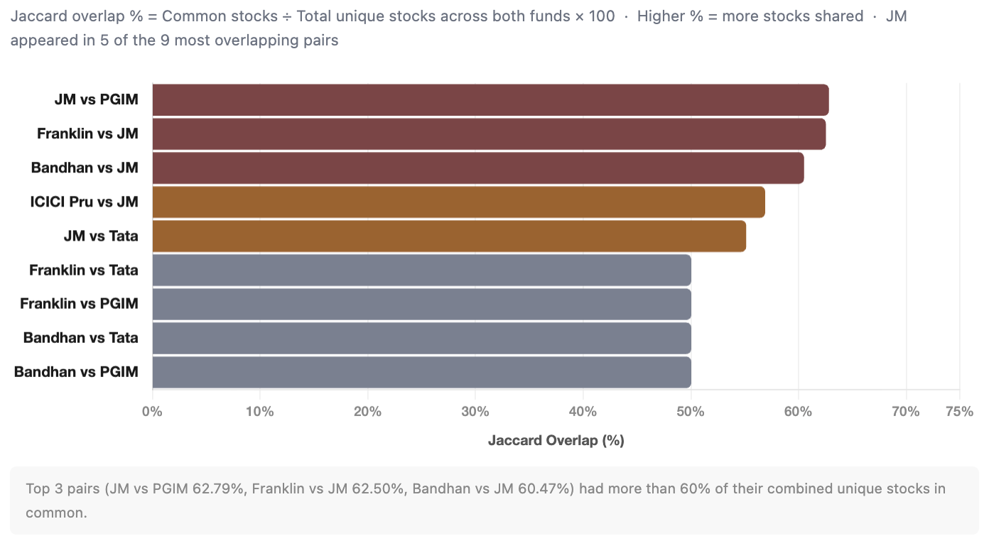
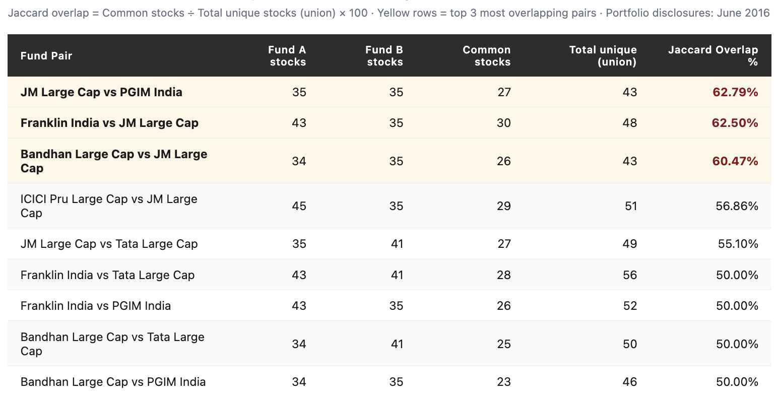
JM Large Cap Fund appeared again and again among the most overlapping pairs.
JM and PGIM had the highest overlap. They shared 27 stocks out of a combined 43 unique stocks. That means 62.79% of their combined stock list was common.
Franklin and JM were almost as similar. They shared 30 stocks out of 48.
Bandhan and JM also had more than 60% overlap.
At this stage, an investor could reasonably ask: If two funds share more than half their stocks, why hold both?
That sounds logical.
But the next ten years show why the answer is not so simple.
How similar were they to the index?
The overlap was not only between active funds. We also compared these active funds with the UTI Nifty 50 Index Fund’s June 2016 portfolio.
We compared the June 2016 portfolios of all six active funds against the UTI Nifty 50 Index Fund’s June 2016 portfolio. The index fund held 50 stocks (the full Nifty 50 constituents at that time).
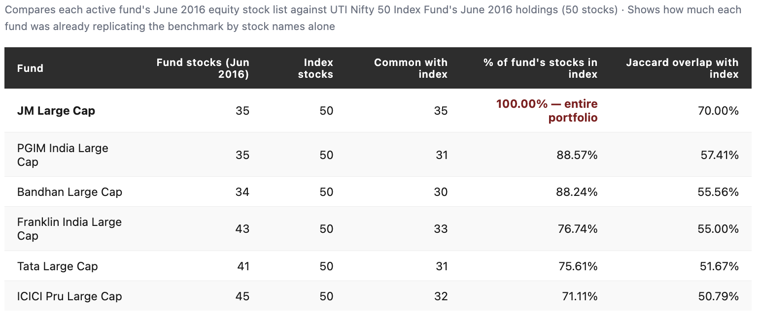
JM Large Cap held 35 stocks in June 2016. Every single one of those stocks was also present in the UTI Nifty 50 Index Fund.
Not most of them. All of them.
PGIM and Bandhan weren’t very different either. Nearly 88% of their holdings were already part of the index. Even ICICI Pru, which was the least index-like fund in this group, had 32 of its 45 stocks in the Nifty 50.
This tells us something important.
These active large-cap funds were not trying to be different by owning completely different companies. A large part of the active decision was in sizing.
How much should be allocated to each stock? Which index stocks are overweight? Which are underweight? And which few non-index stocks should be added?
That’s where active management was happening.
Results
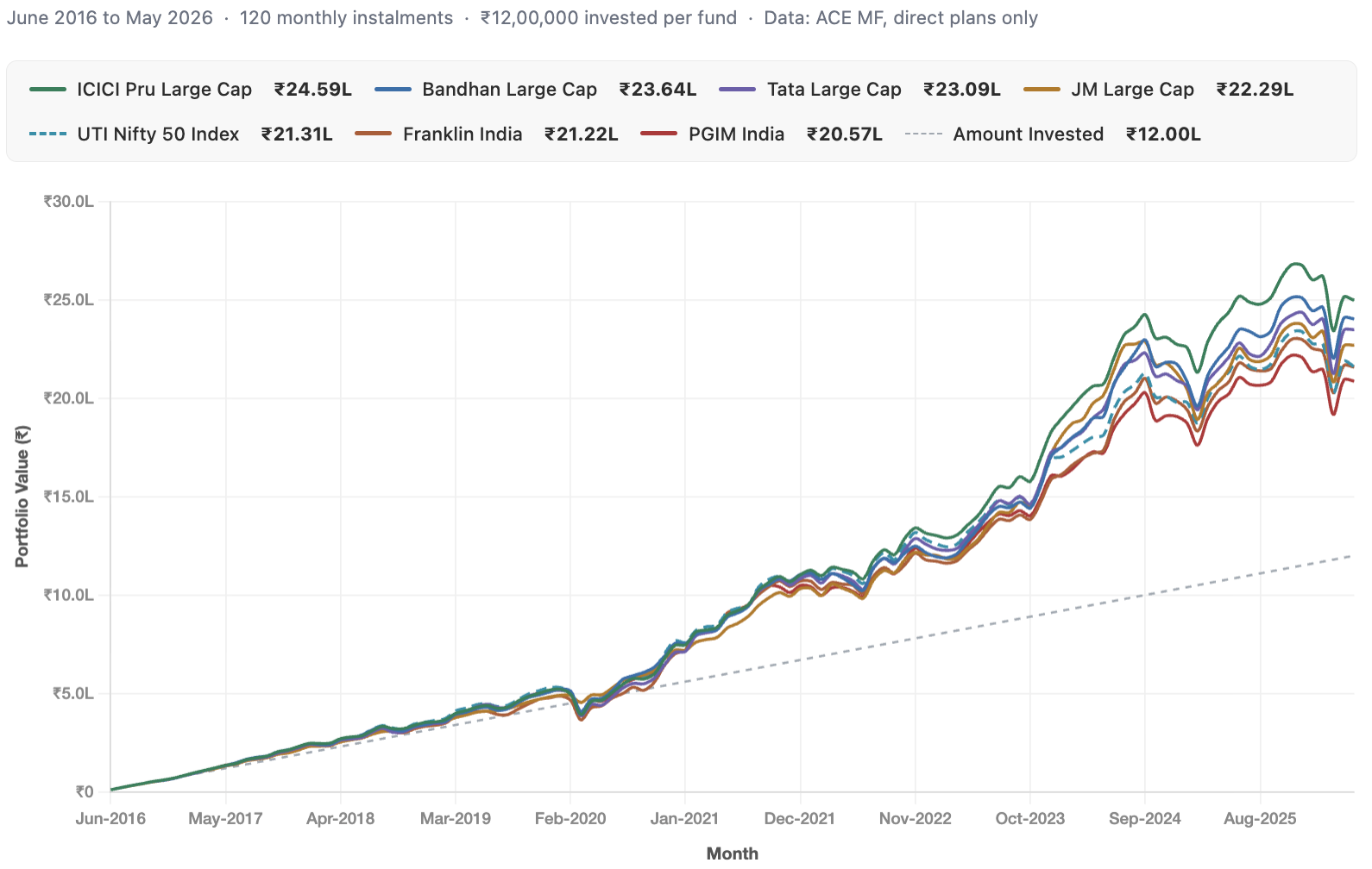
What happened to a Rs 10,000 monthly SIP?
At first glance, the results look fairly similar.
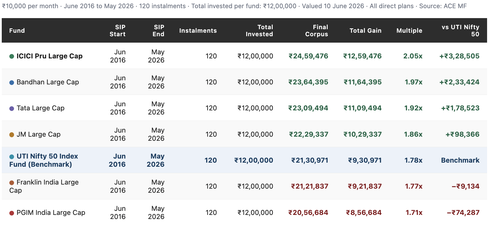
Every fund turned Rs 12 lakh into somewhere between Rs 20.6 lakh and Rs 24.6 lakh. In other words, they all behaved like large-cap equity funds. None massively outperformed, and none dramatically underperformed.
They all moved broadly with the market.
But they weren’t really identical.
ICICI Pru delivered the highest final corpus at Rs 24.59 lakh, beating the UTI Nifty 50 Index Fund by Rs 3.29 lakh. At the other end, PGIM finished with Rs 20.57 lakh, trailing the index by about Rs 74,000.
That means two funds that started with highly overlapping portfolios ended up creating a gap of roughly Rs 4.03 lakh on the same Rs 12 lakh investment.
So while these funds often owned many of the same stocks, the outcomes were still meaningfully different.
Pair-by-pair, what changed?
Now let us look at the exact fund pairs.
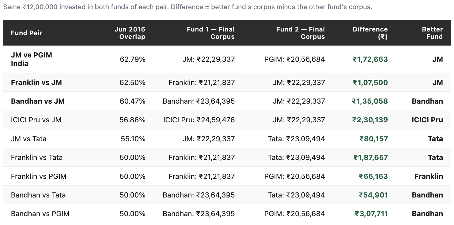
Some fund pairs stayed remarkably close despite a decade of investing. Bandhan and Tata, which had 50% portfolio overlap in June 2016, ended up just Rs 54,901 apart. Franklin and PGIM, also with 50% overlap, were separated by only Rs 65,153. JM and Tata finished less than Rs 81,000 apart.
For a ten-year SIP, those are relatively small differences.
But not every pair followed the same pattern.
Bandhan and PGIM started with 50% overlap, yet Bandhan finished ahead by Rs 3.08 lakh. ICICI Pru and JM had nearly 57% overlap, but ICICI Pru ended ahead by Rs 2.30 lakh.
In other words, portfolio overlap did pull many funds into the same broad return range. Funds that owned many of the same stocks generally ended up in the same ballpark.
But overlap did not lock their returns together.
Small differences in stock weights, portfolio changes over time, and investment decisions along the way were enough to create meaningful gaps in outcomes.
Why did similar funds produce different outcomes?
The answer is simple.
Owning the same stocks is only part of the story. What matters just as much is how much of each stock a fund owns, when it buys or sells, and how the portfolio changes over time.
Two funds can start with very similar portfolios and still take different paths over the next ten years. Those small differences compound.
That’s why JM Large Cap, despite having all 35 of its stocks inside the Nifty 50, still beat the index by Rs 98,366.
And that’s why PGIM, even with nearly 89% of its holdings overlapping with the index, ended up trailing it.
The stock lists were similar. The decisions behind those stock lists were not.
Did the index fund do better or worse?
The UTI Nifty 50 Index Fund turned a Rs 10,000 monthly SIP from June 2016 to May 2026 into Rs 21,30,971 by 10 June 2026.
How did the active funds compare?
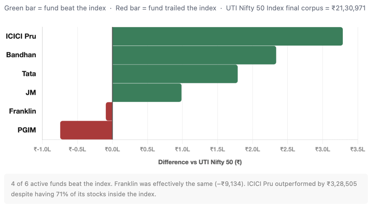
Four of the six active funds finished ahead of the index, while two finished below it.
Franklin India Large Cap came closest, ending just Rs 9,134 below the index. Essentially the same outcome. PGIM trailed the index by Rs 74,287. At the other end, ICICI Pru outperformed the index by Rs 3,28,505, the largest margin among the six funds.
What’s particularly interesting is JM Large Cap. Even though all 35 of its stocks were already present in the Nifty 50, it still generated Rs 98,366 more than the index over ten years.
That reinforces the same point that active management is not just about owning different stocks.
ICICI Pru reinforces the same idea. It had the lowest overlap with the index among the six funds yet delivered the highest outperformance.
So the difference wasn’t simply the stocks they owned. It was what fund managers did with them.
The Real Takeaway
The idea from this study is that overlap is neither good nor bad.
Large-cap funds are naturally forced into the same investment universe.
As a result, portfolios often start with many of the same ingredients. But the final outcome depends on how those ingredients are used.
And that’s where active management comes in.
When people debate active versus passive investing, the conversation often focuses on the final result: did the fund beat the index or not?
What gets overlooked is everything that goes into trying to achieve that result.
How much of a stock should the fund own? Which sectors deserve a larger allocation? When should positions be increased, reduced, or exited altogether? Which opportunities outside the index are worth taking?
These decisions may seem small in isolation. But over years, they compound.
Our study showed exactly that. Funds that started with highly similar portfolios still ended up delivering meaningfully different outcomes. Some beat the index. Some didn’t.
The stock universe was largely the same.
The decisions were not.
And in mutual fund investing, those decisions are often where the difference is made.
Note:
Overlap only looks at stock names, not allocation. Two funds may own many of the same stocks, but they can still perform differently depending on how much money they invest in each stock.
The results are based on one specific 10-year period. This period included both the COVID-19 market crash and a strong market recovery. Results could be different in another time period.
The SIP assumes perfect investing discipline. We assumed ₹10,000 was invested every month on the first available NAV date without fail. Actual investor behaviour may differ.
This study looks at only six funds. These were chosen because they had the highest portfolio overlap in June 2016 and enough historical data. They do not represent all large-cap funds.
Taxes, exit loads, and other costs are not included. These can affect the returns investors actually receive.
Portfolio overlap was measured only once, in June 2016. Fund portfolios changed over time, so the level of overlap between them also changed during the following ten years.