

Last time, we looked at what happens at all-time highs.
We studied 20 years of Nifty 50 data and found 47 times when the market crossed a level it had never reached before.
That study focused on the moment at the top.
This one is about what happens after.
Right now, the Nifty is going through exactly that phase. It hit an all-time high of 26,328 on 2 January 2026. Then it started falling. First slowly, then faster, with a few strong recoveries in between that did not last.
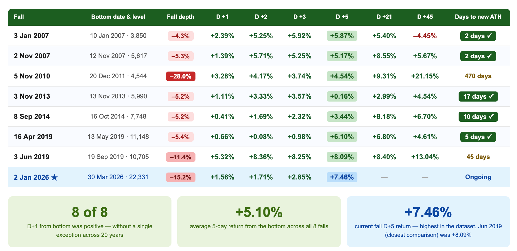
From 26,328 (all-time high), it reached a low of 22,331 on 30 March, a fall of 15.2%.
Since then, the market has started moving up again. As of 9 April, it is up 6.5% from the low, but still below the January peak.
Which brings us to the real question.
When the market starts recovering like this, can you tell it is real? Is it different from the earlier bounces that failed? How long do recoveries usually take?
And more importantly, do we even have an answer to this?
To understand this, we studied every meaningful fall that came after an all-time high over the last 20 years.
The experiment
We looked at 47 times when the market hit an all-time high.
Out of these, 18 turned out to be real peaks, meaning the market fell at least 5% within the next three months.
But even among these 18, not all falls really mattered.
In 10 cases, the market recovered almost immediately, within a day or two. It dipped slightly and then went on to make a new high. These were not real declines, just small pauses during a strong bull run.
That leaves us with 8 cases where the fall was actually meaningful. In these, the market stayed down for longer, days, weeks, or even months, before finding a bottom and recovering.
We focused on these 8 real declines. For each one, we tracked three key things.
First, we looked at how the fall actually played out. How many days the market went up, how many days it went down, and how often it seemed like it was recovering before falling again.
Second, we checked what would have happened if you tried to sell during the fall, at 5%, 10%, or 15% below the all-time high.
Third, and most importantly, we measured how long it took for the market to hit the bottom and how long it took to recover and reach a new all-time high after that.
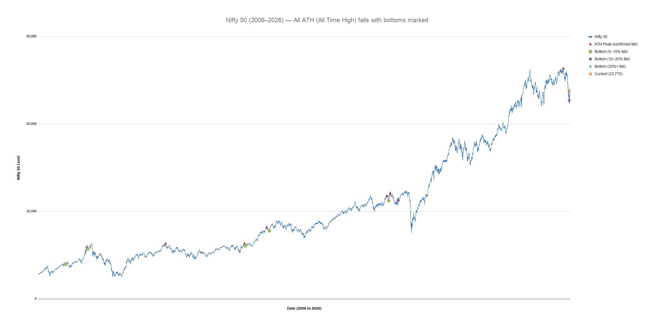
Every red triangle on this chart shows a point where the Nifty hit an all-time high and then fell meaningfully. Every green, purple, or teal dot shows where that fall finally ended, the point where the market found its bottom before recovering.
Looking at the chart, it all seems simple. The market peaks, falls, finds a bottom, and then recovers. It looks clear and easy to understand in hindsight.
But it never feels this clear when you are actually living through it.
Results
A fall doesn’t look like a fall while you’re inside it
This is the clearest pattern in the data, and it explains why market corrections feel so confusing.
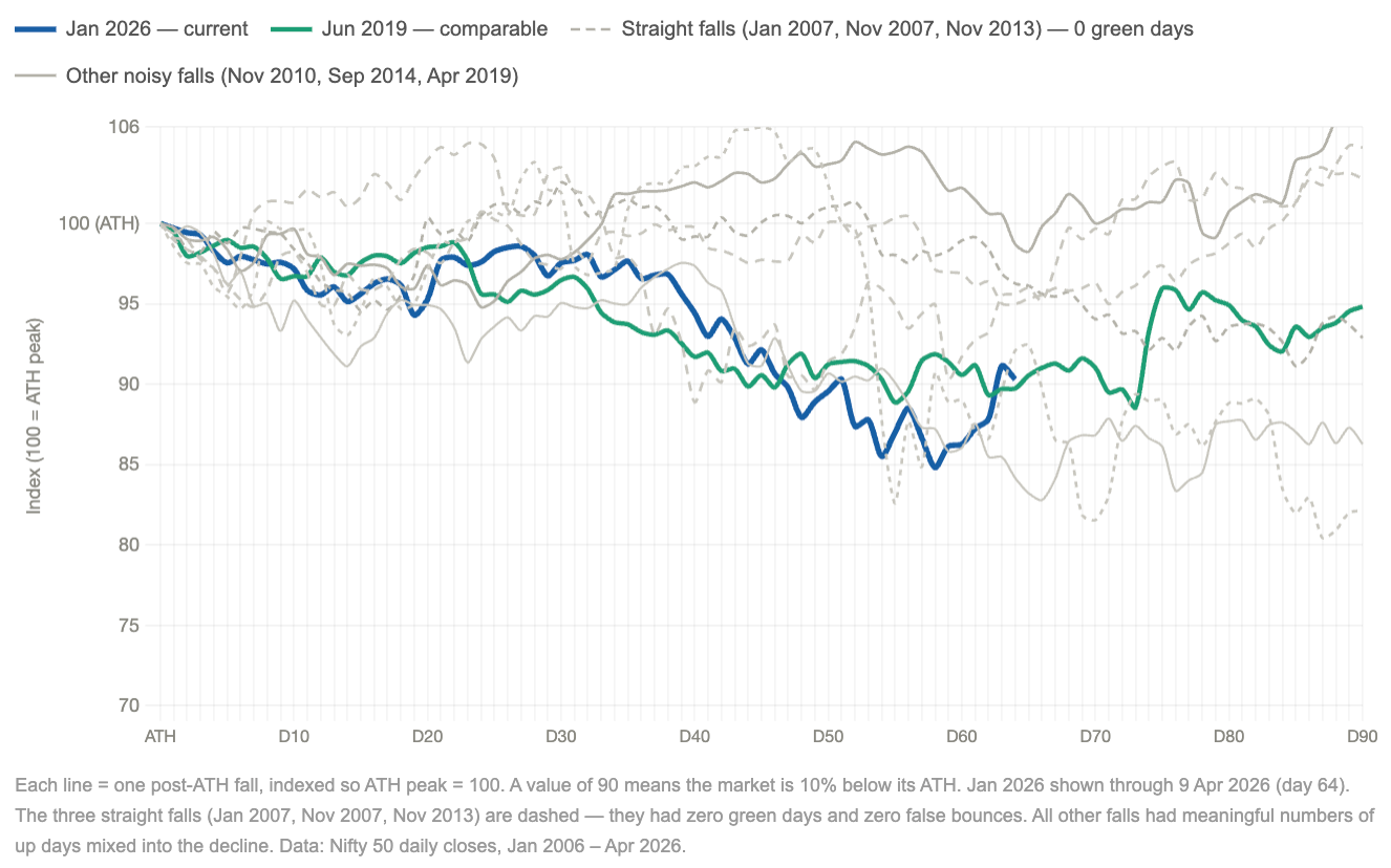
Look at the chart. Every line starts at the peak and moves lower over time. But none of them fall in a straight line. During most real falls, the market doesn’t move down in a straight line. It moves in waves. It falls, then rises, then falls again. And these up moves are not rare. They happen often.
Those rises are the problem. They look like recoveries. They feel like the fall might be over. But most of the time, they are not.
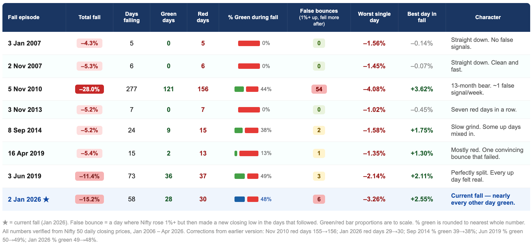
In longer declines, nearly half of all trading days are positive. In the current fall, about 49% of the days between the January peak and the March bottom were green. The market was going up almost as often as it was going down, even while trending lower overall.
In three of the eight falls, there were no green days at all. The market fell quickly and in a straight line (January 2007, November 2007, and November 2013). Six to seven trading days, all red, and it was over.
The other five were different. And the current fall has been the most extreme example.
This is what changes the experience. It feels like uncertainty and not a certain fall or rise.
Within this back and forth, some days stand out. Strong up days where the market rises 1% or more. These feel like turning points. They look like the start of a recovery. But many turn out to be not.
We call these false bounces. Short rallies that are followed by further declines.
We are not trying to say whether the current rise is real or not. The point is simpler.
A market fall is not easy to recognise while it is happening. In hindsight, the bottom looks obvious. But in real time, the market keeps moving up and down, with several convincing rallies along the way.
Because of this, the actual bottom never stands out clearly.
And when the real recovery finally begins, it looks exactly like those earlier false bounces. There is no clear signal that tells you, this is the one.
So by the time it feels real, the market has usually already moved higher.
A market fall is designed in a way that makes it hard to act confidently. It keeps giving you signals that look real but don’t hold. So if you wait for a clear, reliable sign that the fall is over, you will almost always be late.If your strategy depends on recognising that exact turning point, it’s likely to fail, not because you’re wrong, but because the market never makes that moment obvious.
Selling partway through almost always made things worse
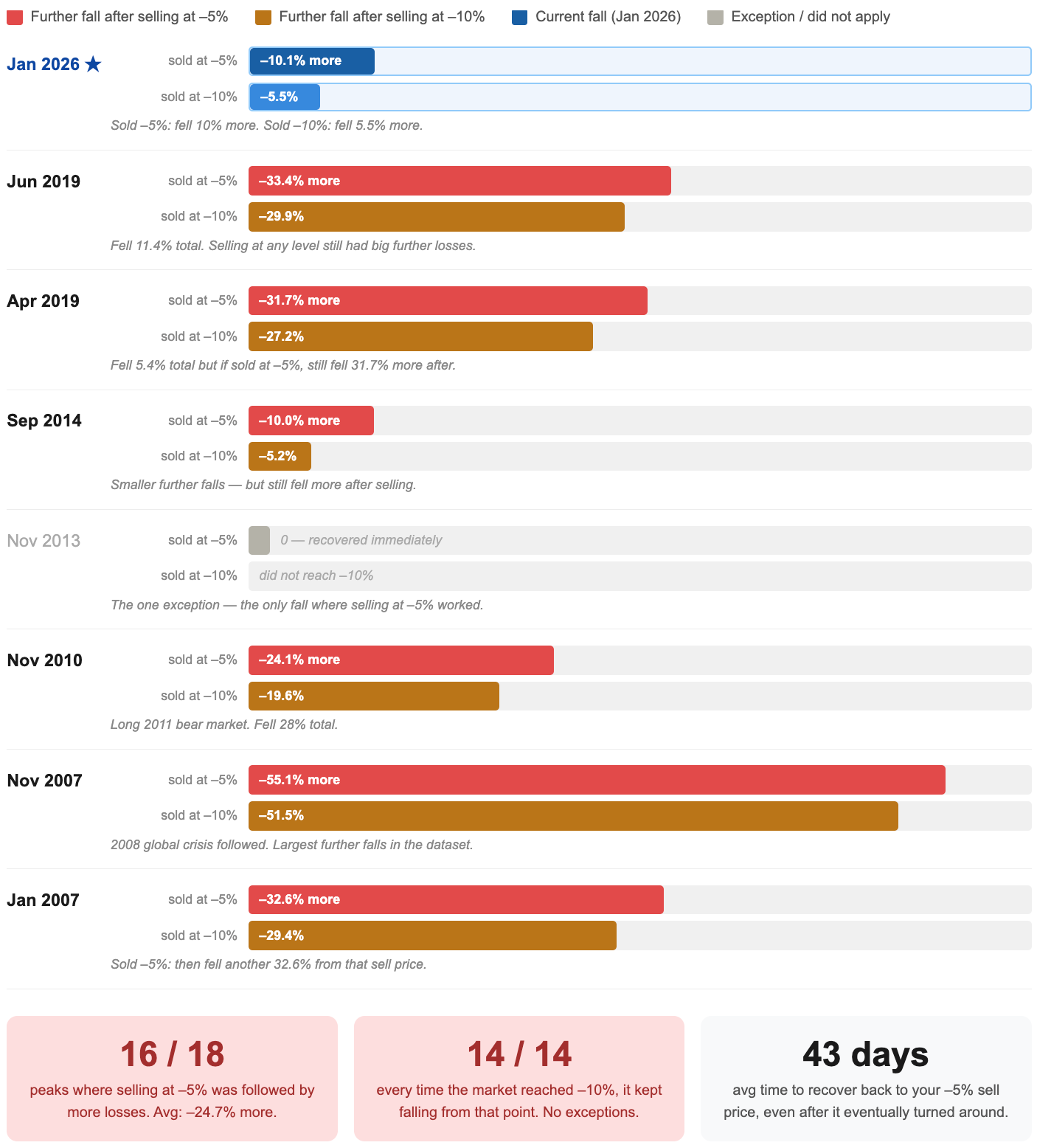
If not at the all-time high, most investors sell after the fall has started. They watch it drop 5%, decide it’s real, and get out. Or they wait for 10%.
We tested both scenarios across all 18 confirmed peaks over 20 years.
We looked at all 18 confirmed peaks, not just the 8 deeper falls. Because at the moment you are making the decision, you don’t know which kind of fall this will turn into. It could recover quickly, or it could keep falling. So the right way to test this is to include every case where a decline had already begun.
The result is the same either way.
If you sold at -5% down (across all 18 confirmed peaks) the market continued falling in 16 of 18 cases. The average additional decline from your sell price was 24.7%.
If you sold at -10% down, the market fell further every single time. All 14 cases where the Nifty reached,10% below the ATH saw further selling from that level. Average additional fall: 23.5%.
November 2013 is the one case where selling at –5% worked — the market recovered almost immediately. It happened once in eight real falls.
But the deeper problem isn’t even that the market keeps falling after you sell. It’s what happens next. Once you’ve exited, the problem changes. It’s no longer about avoiding losses, it’s about deciding when to come back in.
And this is where the confusion from the fall carries forward.
Because the recovery begins in the same way the false bounces did, with a few strong up days that don’t yet feel trustworthy.
So the decision that feels like it will reduce uncertainty ends up creating a new one. Instead of asking “should I sell?”, you’re now asking “is this the real recovery?” And because the market has already shown you multiple failed recoveries during the fall, you hesitate. By the time it feels safe again, a part of the recovery has already happened.
When the bottom comes, it doesn’t wait
This is the finding that matters most right now.
In every single completed fall in our 20-year dataset, all seven of them, the five trading days after the bottom were positive.
The average return in the 5 trading days after the bottom was +5.1%. The average in the 21 trading days after the bottom was +7.1%, with every single one positive.
The current fall bottomed on 30 March 2026. In the five trading days after that bottom, the Nifty rose 7.5%. That is consistent with every previous post-ATH fall bottom in our dataset.
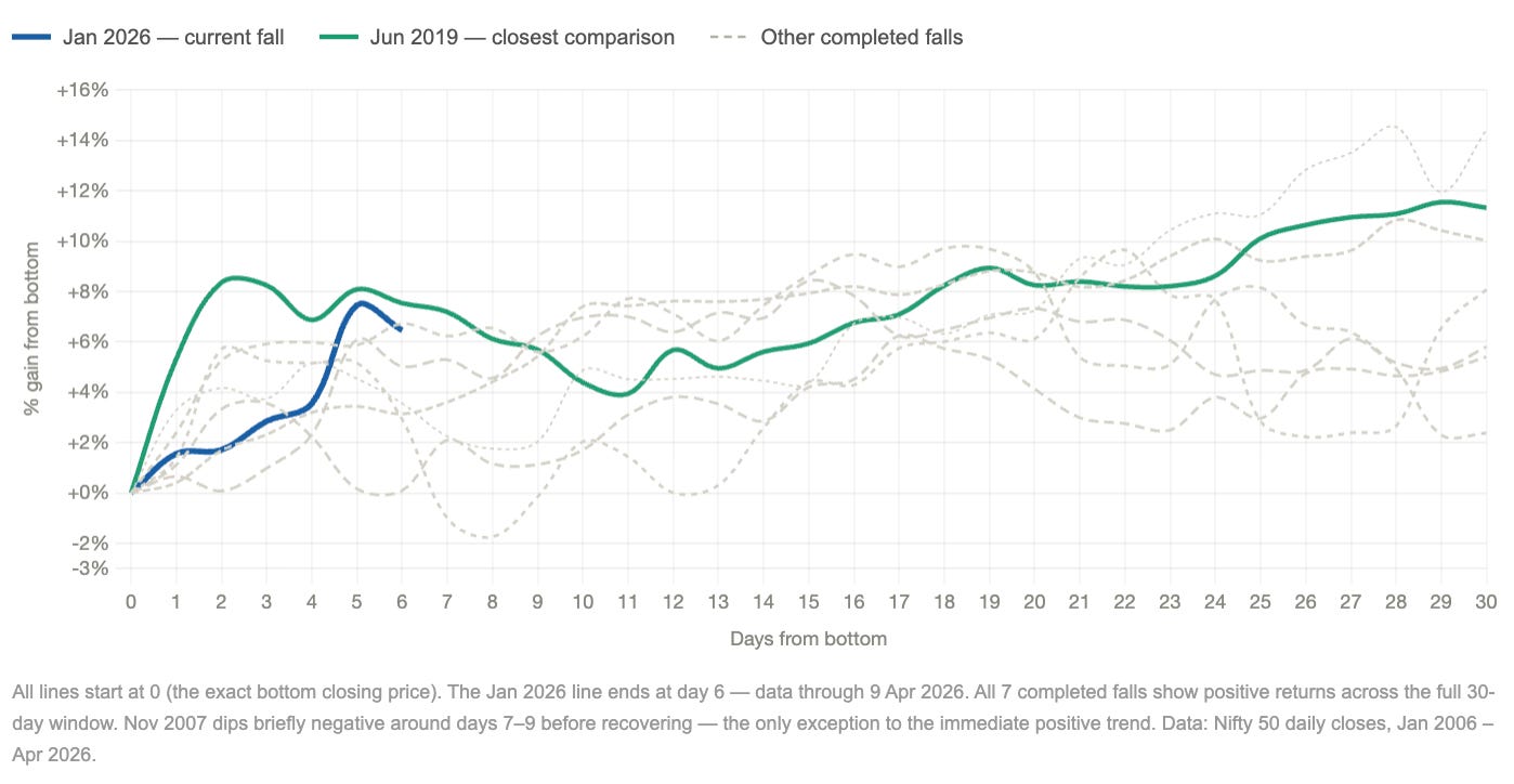
Look at how the recoveries moved from the bottom. They were not slow. In four of the seven completed falls, the market was back at its all-time high level within just 10 trading days of the bottom. Two of the fastest, January 2007 and November 2007, recovered in just 2 trading days from the bottom.
What this shows is that the market does not pause at the bottom. It does not move sideways or give time for confirmation. It turns and starts moving up almost immediately. There is no clear transition point where the fall ends and the recovery begins. The shift happens while uncertainty is still high.
When we extend this further and look at how long it takes to recover fully back to a new all-time high, the results are even more surprising.
Recovery is usually faster than the fall
If you look at how long markets take to fall versus how long they take to recover, a clear pattern emerges.
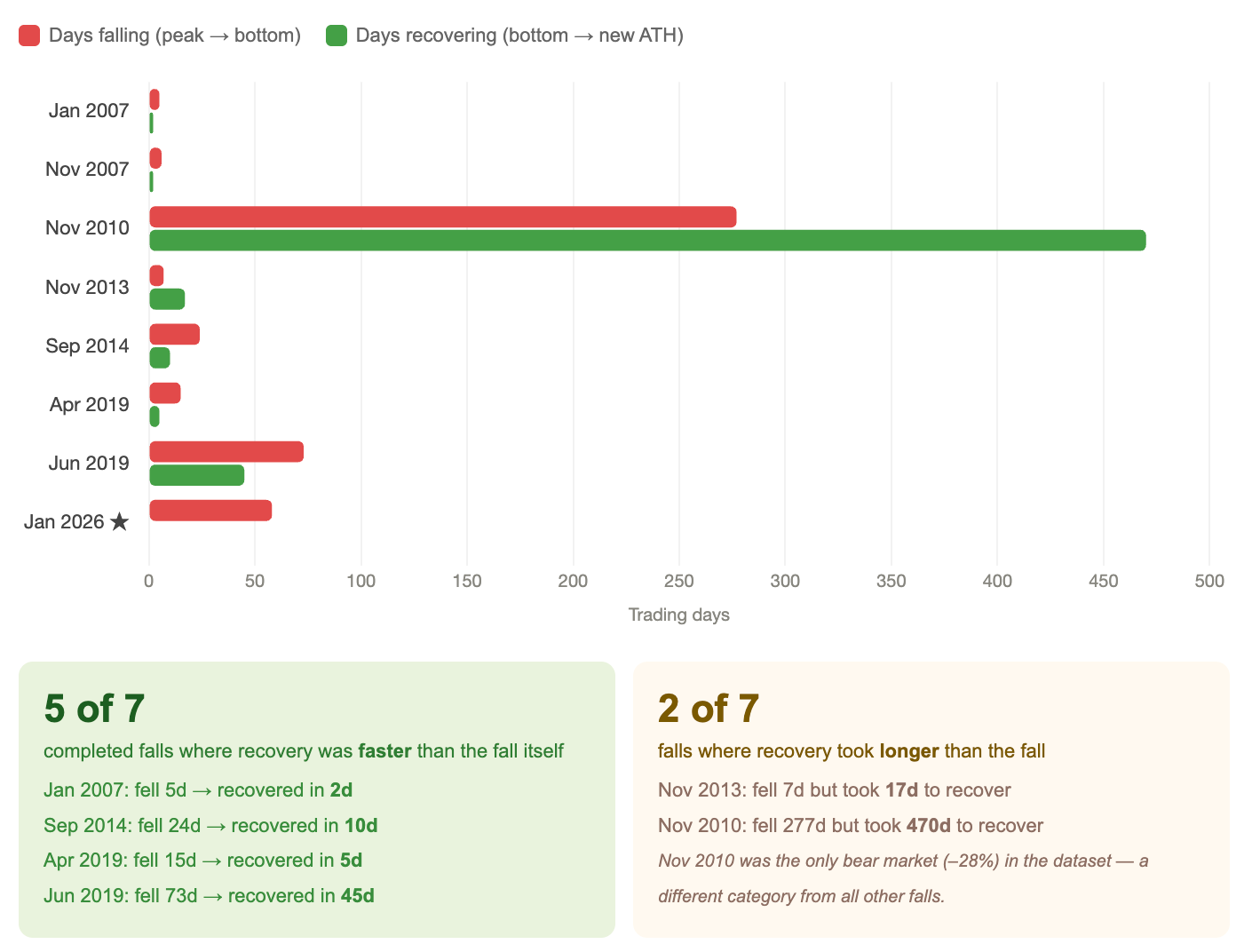
Days falling vs days recovering, side by side for each episode
In five of seven completed falls, the time it took to recover from the bottom back to the all-time high was shorter than the time it took to fall from the all-time high to the bottom.
The market tends to fall slowly and recover quickly.
January 2007 fell in 5 trading days but recovered in just 2. September 2014 fell over 24 days and recovered in 10. April 2019 fell over 15 days and recovered in 5. Even the deeper June 2019 correction, which took 73 days to fall, recovered in 45 days.
There is a clear difference in how markets fall and how they recover. The fall usually takes time and feels uncertain. It moves slowly, with mixed signals and no clear direction. But when the recovery begins, it is often faster and more decisive.
If you wait for clear signs that the recovery has started, like steady gains or better news, you will likely be late. By the time it feels obvious, the market has already moved higher.
Markets do not move in a balanced way. They fall slowly and in a confusing manner, but they tend to recover faster, which makes the recovery easier to miss.
Conclusion
This study set out to answer a simple question: when a market fall starts reversing, can you actually tell?
The data suggests that in most cases, you cannot.
The bottom is not something you recognise at the moment. It is something you recognise after the market has already moved away from it.
Which is the hardest part of all this. Not the falling. Not the uncertainty while it’s happening.
The hardest part is that it may already be over and you won’t know until it’s too late to act on it.
The broader lesson is not that markets always recover quickly or that every fall is temporary. It is more specific.
Timing the market means getting two decisions right. When to exit, and when to come back in. Doing both consistently is very difficult.
Even studies have shown that investors who got their timing wrong still did better than those who stayed out waiting for the perfect moment.
The cost of waiting for certainty is usually higher than the cost of staying invested.
Over time, what has worked more consistently is staying in the market, not trying to time it.
Limitations of the experiment
The study is based on 20 years of Nifty 50 data (2 January 2006 to 9 April 2026), with only 8 meaningful post all-time-high falls.
The findings show patterns in past data, not guarantees.
The results depend on definitions. What counts as a confirmed peak, meaningful fall, false bounce, or recovery, is based on chosen thresholds. Changing these would change the conclusions.
The analysis uses only Nifty 50 closing prices. It does not capture intraday moves, volumes, sector differences, or stock-level behavior.
The study is based on hindsight. Bottoms and recoveries are identified after they happen, not in real time.
It does not fully reflect real investor behavior. It excludes taxes, transaction costs, emotions, and different entry or exit strategies.
The current fall (Jan 2026) is still ongoing, so its final outcome is unknown.
All falls occurred within a broader bull market. Results may differ in a prolonged bear market.
The analysis focuses only on the Nifty 50. Other indices or asset classes may behave differently.
I think Groww is not take gold in assets
Wonderful analysis giving hope in hard times.